Analysis:
« Nice:
• I like the navigation part below of the homepage. It easy for me to navigate and search without reload the page
• The drop down menu is clear and categories.
• The homepage of the website is very high class.
« Weak:
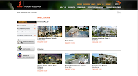
• Other than homepage, the page is like change to sudden. My eyes got a bit pain when the page suddenly from black colour background change to white.
• It is organize, but why should they list down maximum 3 name under the drop down menu for user to click then there should be more than 10 of them. For me as a user, if it direct bring me to the list of all of them will be better.
• The navigation buttons which been set to "should not be click-able", the list from the drop down menu is where we can click, but when come to Integrated Development" button, it suddenly link me to the webpage of www.sunwayproperty.com, it cause me a shock when I accidentally click on it.
Analysis:
« Nice:
• Nice full page slide as the background of the homepage. Good naming is state for each of the picture, which to let the user know where is the place of the picture taken.
• Nice drop down menu with some background graphics, and me as a user can look through clearly about the categories of them.
• Nice lightbox been used for the gallery photos.
« Weak:
• The red and white box which use to place the latest news is very abstract. It cause the whole website contrast everywhere, hard to know where should we focus, if look at the homepage for too long, my head will be headed too.
• The background image for the navigation drop down menu box is a bit annoying when we using it in the homepage. It cause a bit blend into the background.
Malaysia Land Sdn Bhd
Analysis:
SP Setia Bhd
Analysis:
Analysis:
Analysis:
« Nice:
• Nice brochure layout used.
• Interesting navigation used.
• Nice lightbox use to show the image clearer.
« Weak:
• It is too bad, the text in the website cannot be highlight and copy.
• The information that provide is not detail and complete enough.
SP Setia Bhd
Analysis:
« Nice:
• Nice slideshow of photos with the naming of places clearer.
• Consistent navigation placement, easy to navigate.
• Nice drop down content been used to store large information. It make the page clean and clear.
« Weak:
• The footer treatment of the website is bad.
• The background used is too down, hard to catch user attention.
Analysis:
« Nice:
• Nice colour mood of the website. It show elegant and class.
• Nice flash slideshow with the naming and the picture cut out.
• Lightbox is use to present the map of the places and the photos.
« Weak:
• The logo is too big and annoying.
• The navigation bar can be improve, because when the 1st time I explore this website, I almost can't find the navigation bar which provide in the homepage.


0 comments:
Post a Comment